
Christal's Kitchen
OVERVIEW
Christal's Kitchen is a mobile food delivery and e-commerce platform conceptually designed to solve key user frustrations related to menu browsing fatigue and hidden costs in the online ordering experience. The application features a highly visual interface with clear categorical filtering, prioritizing speed and ease of use for the busy professional persona. The resulting design provides a transparent and efficient path from food discovery to a low-friction card payment checkout.

ROLE
UI/UX DESIGNER
TOOLS
Figma — Interface design & prototyping
Illustrator — Logo & visual identity
After Effects — Micro-interactions
DURATION
3 weeks
The Problem/Challenge
The design of Christal's Kitchen was necessitated by two critical failings in the current local food ordering system: Menu Discovery Friction and Hidden Cost Frustration.
Users frequently experience high cognitive load and browsing complexity due to cluttered menus and inadequate filtering, making it difficult to find desired items quickly, which often leads to abandonment. Crucially, existing platforms fail to provide adequate pricing transparency, introducing unexpected delivery or tax fees late in the checkout process, resulting in "checkout shock" and high rates of cart abandonment.
Solution
Christal's Kitchen delivers a solution focused on efficient discovery and absolute cost transparency, transforming the user's experience from frustrating to friction-free. The app utilizes a visually driven interface with horizontal category pills and high-quality photography to dramatically reduce browsing complexity and save users time. Crucially, it eliminates 'checkout shock' by explicitly breaking down Subtotal, Delivery, and Tax on the Cart screen, ensuring users have full confidence in the final price before finalizing their purchase.

Design Goals
The goal was to move beyond the traditional cluttered menu experience and create a visually appealing, low-friction ordering platform that optimizes the user journey from browsing to final payment. The solution is a mobile-first app emphasizing clear categorization, high-quality visuals, and a speedy, 2-step checkout flow.
Research & Discovery (Understanding the Users)
My design process was grounded in understanding user psychology related to online food ordering. The research phase focused on Competitive Analysis of leading local and global food apps, combined with Informal User Interviews (4 participants) to pinpoint common frustrations.
-
Key Insight 1: Visual Trust is Paramount. Users highly associate the quality of the food image with the trustworthiness and reliability of the vendor. High-quality, authentic visuals were therefore prioritized to drive conversions.
-
Key Insight 2: Speed and Clarity are Non-Negotiable. Users, particularly busy professionals, need explicit categories (like 'Cake' or 'Fast Food') for quick filtering, as endless scrolling leads to immediate abandonment.
-
Key Insight 3: The Pricing Expectation. The greatest frustration reported was unexpected fees (delivery, tax) appearing only at the final step. Price transparency needed to be designed into the flow early on.

User Definition & Strategy
The primary user is The Busy Professional, Zuri Johnson, a 32-year-old who values reliability and time efficiency.
-
Zuri's Goal: She needs quick, reliable dinner options after a long workday and wants to place an order in under 5 minutes.
-
Zuri's Frustration: Cluttered menus and the time wasted calculating final costs due to hidden fees.
This led to the core Problem Statement: Zuri, the busy professional, needs a way to filter and order high-quality, local food quickly with clear pricing so that she can save time after work and feel confident about the final cost of her meal.
The resulting user flow was streamlined: Discover Filter, Category, Item Detail, Reviews, Cart, Card Payment.

Ideation & Design Process
The early design phase focused on establishing a strong, mobile-first Information Architecture (IA).
-
IA Focus: A flat hierarchy with readily accessible categories was chosen over deep, complex navigational menus to support the user's need for speed.
-
Wireframing Rationale: I utilized a consistent two-column grid for all product listings to maximize item visibility while using screen real estate efficiently. Initial sketches also focused on the placement of primary actions (like the 'Add to Cart' button) within the lower third of the screen for better one-handed mobile use.

hierarchy with readily accessible categories
Cart
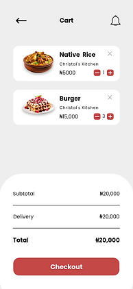
Check out
Color
Deep red
#C44846
Surface White
#FFFFFF
Subtle grey
#E0E0E0
Text/black
#1F1F1F
Typography
Aa
Poppins
Key Interface Annotations
-
Personalized Home Screen: A personalized greeting and user avatar foster a sense of connection. A prominent, high-contrast banner promoting deals like "Free Delivery" draws the user's eye and immediately communicates value.
-
Intuitive Discovery: The key interaction pattern is the use of horizontal scrollable category pills (Nearest, Fast Food, Drink, Cake). This design choice saves screen space and allows users to quickly filter the menu without deep navigation. Each product card features a high-quality image, price, and a trust-building 4.5-star rating.
-
Cart Transparency: This screen directly addresses the user's need for pricing clarity. The summary clearly breaks down Subtotal and Delivery fees before presenting the final, bolded Total. This eliminates surprises and builds user confidence. Users maintain full control with clear +/- buttons for quantity editing.
-
Low-Friction Payment: The checkout flow is simplified to a single payment screen. The key features are the brand-aligned visual representation of the payment card and the final high-contrast "Pay Now" button, driving the user to complete the conversion quickly
.png)
Outcomes & Next Steps
-
This project successfully leveraged user insights to design an efficient and visually appealing food delivery experience. The key takeaway was the power of visual appeal coupled with absolute cost transparency in reducing checkout abandonment.
Screens


Admin Dashboard

Prototype
